ramblings

No more PPT for CENTCOM

Posted on

“We have met the enemy and he is a bloated Microsoft Office Suite product!” ~ paraphrase of Gen. McChrystal
Some choice quotes from this NYT article all about how “Like an insurgency, PowerPoint has crept into the daily lives of military commanders and reached the level of near obsession” are as follows:

  • “PowerPoint makes us stupid,” Gen. James N. Mattis of the Marine Corps, the Joint Forces commander.
  • “It’s dangerous because it can create the illusion of understanding and the illusion of control,” General McMaster
  • “I would be free tonight, but unfortunately, I work kind of late (sadly enough, making PPT slides).” – Lieutenant Nuxol
  • “Some problems in the world are not bullet-izable,” General McMaster

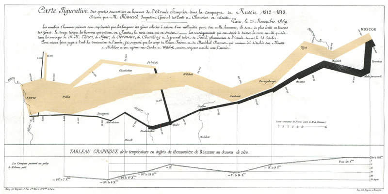
You have got to love the pun in the last one in the list. The image below is a PowerPoint diagram meant to portray the complexity of American strategy in Afghanistan which certainly succeeded in that aim.

The article makes me think of my Tufte related post from back in Jan, 2005 about how PowerPoint was incredibly bad for information dissemination and five years later, the game is still the same. Now though, lives are on the line so, let’s say it all together now: PowerPoint is bad, mmmkay?

ramblings

Best. Chart. EVER.

Posted on

A few months back, I received a mailer about a one-day course on “Presenting Data and Information” that was being taught by Edward Tufte and while I didn’t go to the class, one of the graphics that it contained really impressed me and I’ve been meaning to post it ever since (click on the thumbnail to launch a popup that contains a larger image):

“This map drawn by Charles Joseph Minard portrays the losses suffered by Napoleon’s army in the Russian campaign of 1812. Beginning at the left on the Polish-Russian border near the Niemen, the thick band shows the size of the army (422,000 men) as it invaded Russia. The width of the band indicates the size of the army at each position. In September, the army reached Moscow with 100,000 men. The path of Napoleon’s retreat from Moscow in the bitterly cold winter is depicted by the dark lower band, which is tied to temperature and time scales. The remains of the Grande Armee struggled out of Russia with 10,000 men. Minard’s graphic tells a rich, coherent story with its multivariate data, far more enlightening than just a single number bouncing along over time. Six variables are plotted: the size of the army, its location on a two-dimensional surface, direction of the army’s movement, and tempreature on various dates during the retreat from Moscow. It may well be the best statistical graphic ever drawn.”

Okay, impressed yet? Here is a bit more about Mr. Tufte. Edward Tufte is Professor Emeritus at Yale University, where he taught courses in statistical evidence, information design and interface design. He has written several books, which have won 40 awards for content and design. The NY Times has called him “The Leonardo da Vinci of data.”

Still not impressed? Then try reading this essay which was published in Wired about how PowerPoint affects thought. It will blow your mind. I highly suggest you read it if this topic interests you at all because he is to data what Stephen Hawking or Brian Greene is to physics.

One of my goals this year is to read as many of his books as possible. Wish me luck.